


What is a Flexbox?
Its a CSS3 layout mode that provides an easy and clean way to arrange items within a container without using float. It's Responsive and mobile friendly. It gives ability to alter item's width and height to best fit in it container's available space. Flexbox are built for small scale layout.
Flexbox deals with layout in one dimension at a time, either as a row or as a column, to start using the flexbox, you need to first define the flex-container. To create a flex-container, we set value of the area's container's display property to flex.
.flex-container{
                display:flex;
    }
Flex Properties
Flexbox elements can have many properties some of which are set on the flex container and the others are set on the flex items.
Flex container properties:
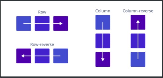
- flex-direction: The main axis is defined by Flex-direction property, which has four possible values: column | Row | column-reverse | row-reverse.
.flex-container{
            flex-direction: row | row-reverse | column | column-reverse;
    }
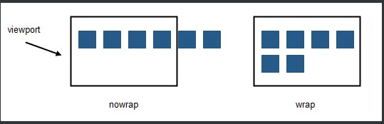
- flex wrap: If you have more items that can fit in one row and you still want a horizontal layout, flex wrap comes in. The flex items will wrap onto multiple lines inside the flex container, the same goes for column. The default value is flex-wrap: nowrap;.
.flex-container{
            flex-direction: row;
            flex-wrap: wrap;
    }
<!--  shorthand for flex-direction and flex-wrap is called flex-flow-->

.flex-container {
  flex-flow: row wrap; // flex-direction + flex-wrap
}
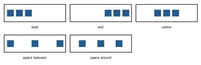
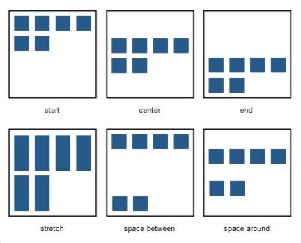
- Justify-content: it horizontally aligns the flexible container's items. it includes:
- flex-start: items are packed toward the container’s left side (it’s the default value).
- flex-end: items are packed toward the container’s right side.
- center: items are placed in the center.
- space-between: items are evenly distributed in the line (the first item is on the left, the last item on the right).
- space-around; Items are positioned with space before, between, and after the lines.
            .flex-container {
                  justify-content: flex-start | flex-end | center | space-between | space-around;
        }
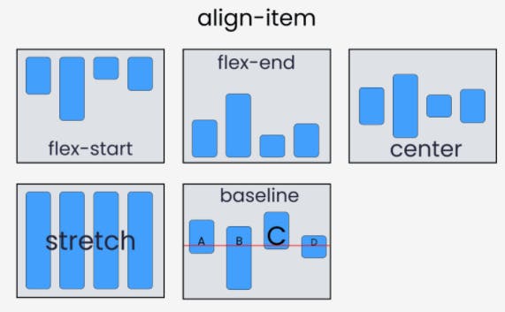
- Align item: The align-items property vertically aligns the flexible container's items. values includes:
- flex-end: Items are positioned at the bottom of the container.
- flex-start: Items are positioned at the top of the container.
- center: Items are positioned at the center of the container (vertically).
- stretch: Items are stretched to fit the container.
- baseline: items are align such as their baselines.
.flex-container {
  align-items: stretch | flex-start | flex-end | center | baseline;
}
- Align content: The align-content property modifies the behavior of the flex-wrap property. It is similar to align-items, but instead of aligning flex items, it aligns flex lines. values includes:
- flex-start: lines are placed in the top part of the container
- flex-end: lines are placed in the bottom part of the container
- center: lines are centered in the middle of the container
- stretch: lines stretch to take up all the available space in the container (it’s the default value)
- space-between: lines are evenly distributed in the container
- space-around: lines are evenly distributed with equal space around each line
.flex-container {
  align-content: flex-start | flex-end | center | space-between | space-around | stretch;
}
Properties for flex items
Objects inside a Flex Container (flex Items) also have their own fled box properties.
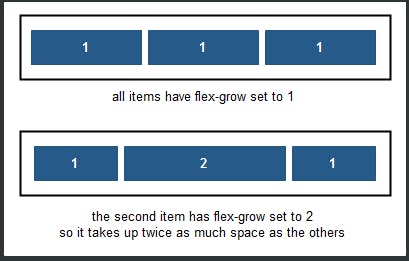
- flex grow: The flex-grow property specifies how much the object will grow relative to the rest of the flexible items inside the same flex container. If all objects have flex-grow set to 1 then the remaining space in the container will be distributed equally to all objects. If one of the objects has a value of 2 then the remaining space will take up twice as much space as the other objects (if possible).
.item1 { flex-grow: 1; }
.item2 { flex-grow: 2; }
- flex shrink: The flex-shrink property specifies how the object will shrink relative to the rest of the flexible items inside the same flex container.
- flex basis: The flex-basis property specifies the initial size of an object before the remaining space is distributed. The length can be in percentages or pixels. If set to 'auto', the extra space is distributed based on the flex-grow value.
.flex-item {
  flex-basis: <length> | auto | content;
}